
Colour in Interior Design: How Colours Affect Mood and Perception
10 March 2025
Colour is not merely an aesthetic choice in interior design; it is a powerful tool that shapes our emotions, influences our perceptions, and defines the atmosphere of a space. The psychology of colour has been widely studied, revealing its profound impact on human behaviour, mood, and overall well-being.
The Psychological Effects of Colour in Home Design<br>
</br>Every colour carries an emotional weight, subtly shifting our moods and behaviours. Whether seeking tranquillity, energy, warmth, or sophistication, a well-curated colour scheme has the power to transform a space into a sanctuary that reflects and supports the lives of its inhabitants.
</br>
</br>The Elegance of Neutrals: A Foundation of Calm
<br>
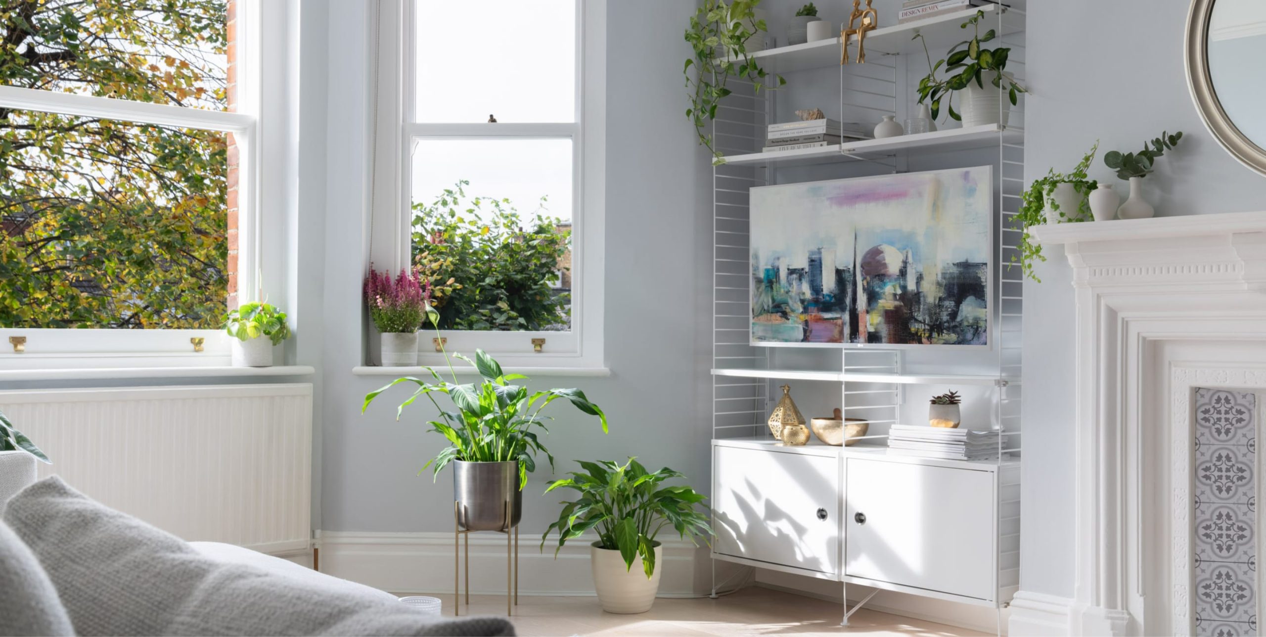
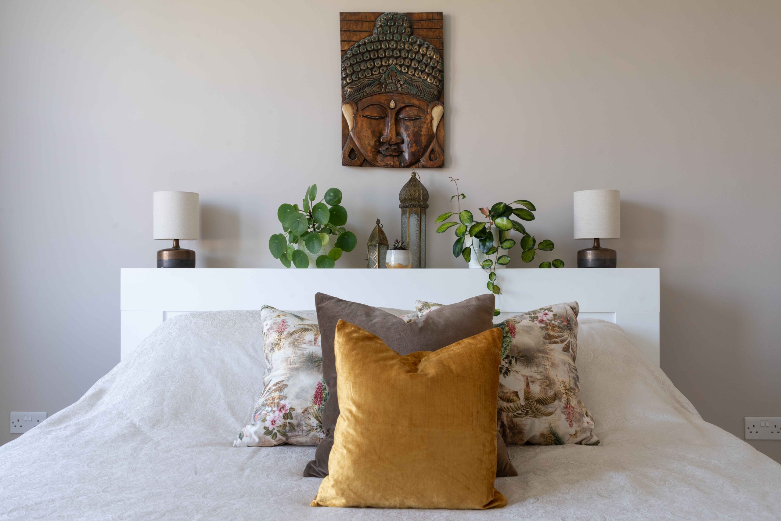
Neutral tones—soft whites, warm greys, and muted beiges—form the foundation of timeless interiors. These hues are known for their calming properties, offering a backdrop of serenity and sophistication. Scandinavian design principles embrace neutral palettes to promote light reflection, creating an airy, expansive feel. Incorporating neutral tones with a refined mix of textures—linen upholstery, stone surfaces, and matte-painted walls—adds depth and visual interest without overwhelming the senses. A neutral colour scheme is ideal for creating a peaceful retreat in any home.
<br>
</br>The Power of Blues: Serenity and Focus
<br>
Blue is often associated with tranquillity, focus, and intellect, making it a perfect choice for home offices, bedrooms, and living spaces designed for relaxation. Darker shades like navy and indigo exude sophistication and depth, while softer hues such as powder blue or muted teal bring a sense of freshness and clarity.
<br>
A well-placed blue accent wall in a study or library can enhance concentration, while a deep blue velvet sofa introduces a touch of understated luxury. Blue is also a wonderful choice for coastal or globally inspired interiors, evoking the endless horizon of the sea or the rich palettes of Mediterranean landscapes.
<br>
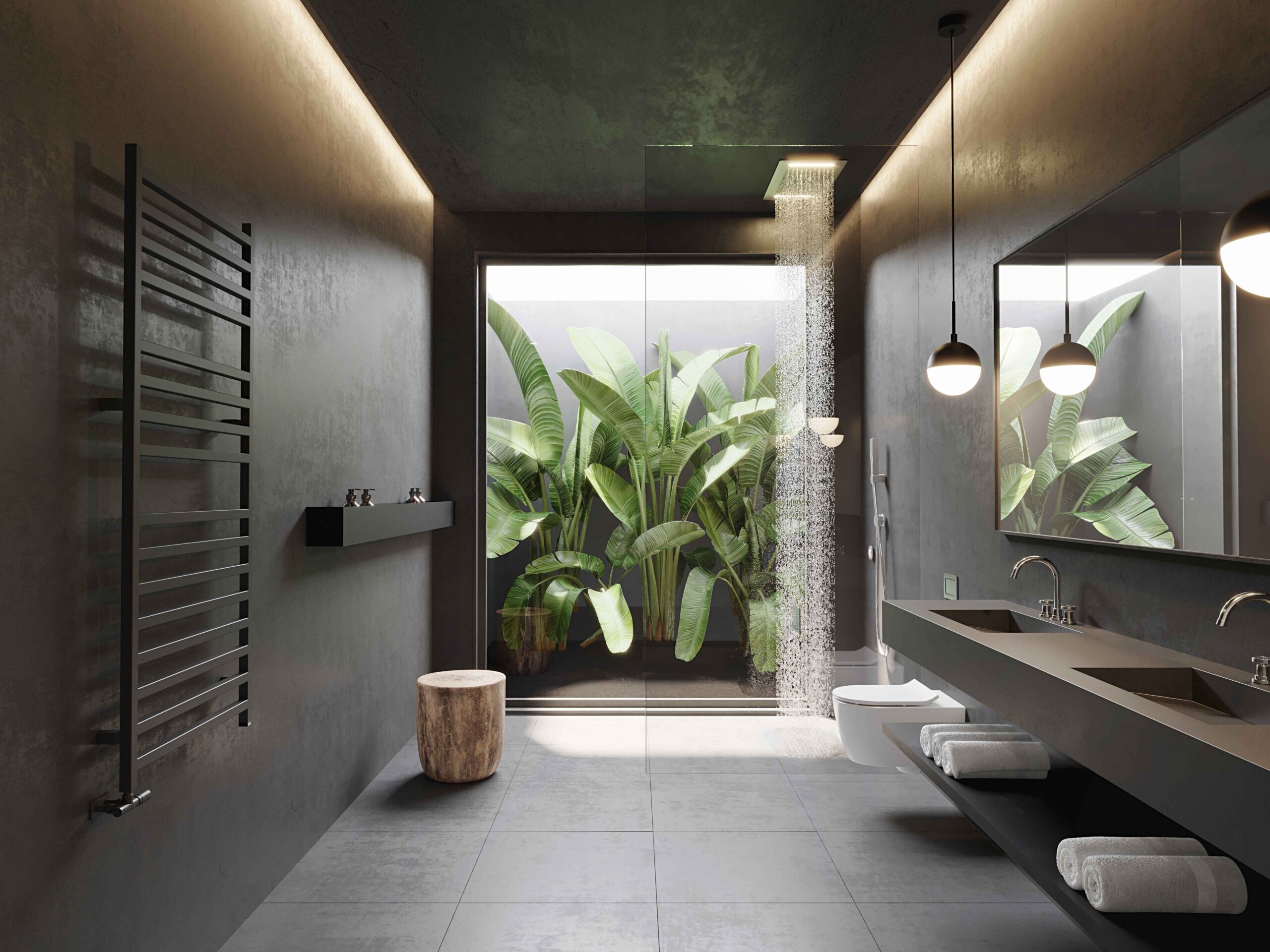
</br>Earthy Greens: Restorative and Grounding
<br>
Green represents renewal, balance, and connection to nature. As biophilic design continues to gain prominence, green has emerged as a key player in interiors that evoke a sense of well-being. From muted sage to deep forest green, these hues seamlessly integrate with organic materials such as natural wood, stone, and rattan.
<br>
For those seeking a space that fosters relaxation and mindfulness, incorporating green into a lounge area or spa-like bathroom can create a restorative atmosphere. Paired with botanical elements or statement pieces in brass or black, green exudes both warmth and refinement.
</br>
</br>The Boldness of Red: Passion and Energy
<br>
Red is a colour of intensity, often associated with passion, dynamism, and confidence. While it may not be the ideal choice for every space, when used strategically, it can make an impactful statement. Deep burgundy or terracotta tones in a dining room evoke warmth and conviviality, encouraging lively conversations over intimate dinners.
<br>
For those who appreciate a more dramatic aesthetic, a carefully chosen red accent piece—perhaps a curated artwork or a sculptural piece of furniture—can introduce a bold sophistication without overwhelming the senses.
<br>
</br>Understated Luxury: The Role of Black and Deep Tones
<br>
Black is the ultimate expression of sophistication, grounding interiors with a sense of depth and modernity. When used in cabinetry, architectural details, or statement furniture, it brings an unparalleled level of refinement. In luxury interiors, deep jewel tones—emerald, aubergine, or sapphire—work beautifully with black to create a layered, opulent effect.
<br>
For those who favour an elegant yet contemporary aesthetic, incorporating these deeper tones in bespoke joinery, moody accent walls, or curated textiles ensures a refined and distinguished ambience.
<br>
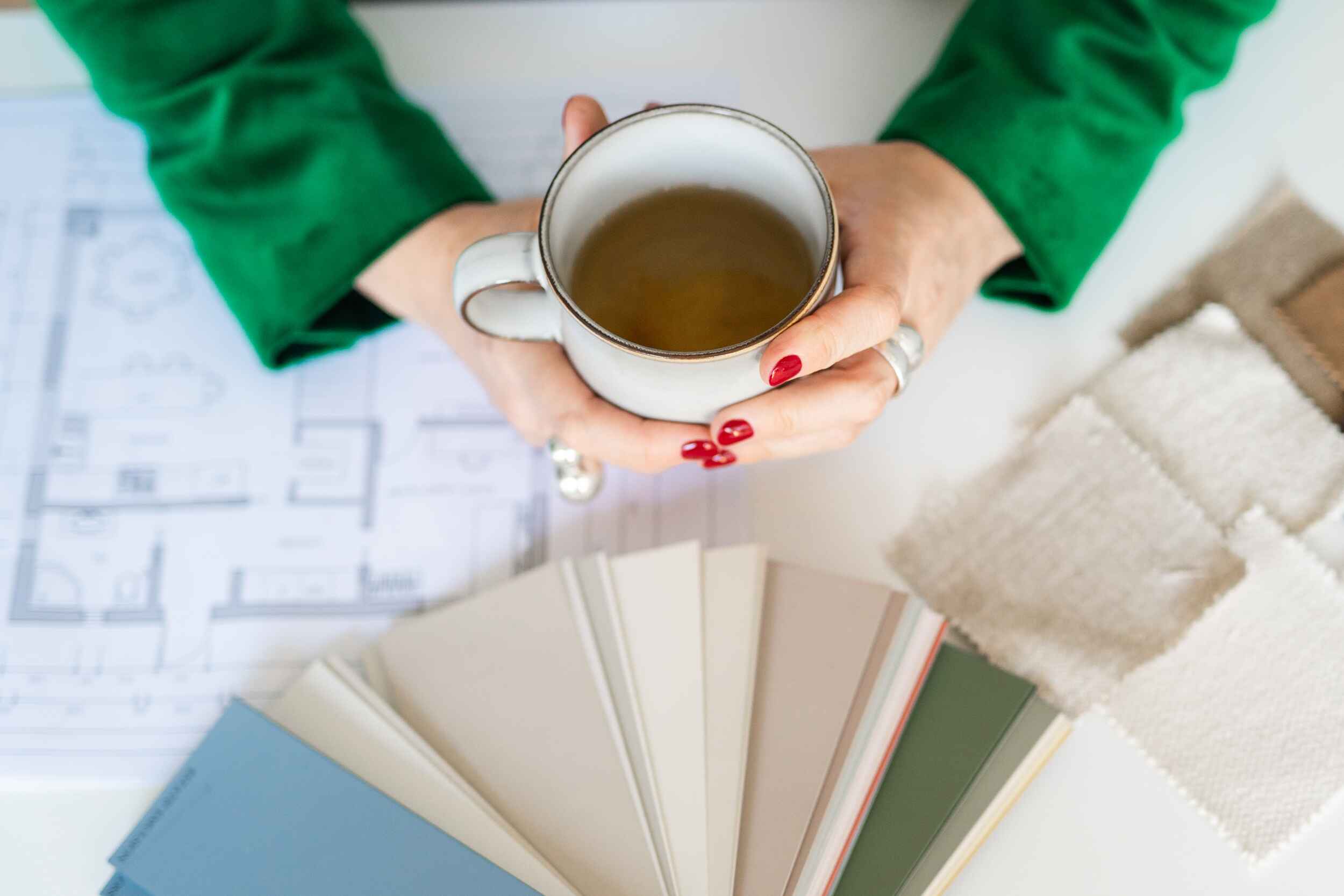
</br>Colour Consultation: Crafting Personalised Palettes
<br>
Selecting the right colour scheme for a home requires more than following trends; it demands a nuanced understanding of light, texture, and spatial harmony. A well-thought-out colour palette aligns with an individual’s lifestyle, aspirations, and the emotional atmosphere they seek to create.
<br>
Through meticulous exploration of hues, materials, and finishes, one can curate spaces that do not simply look exquisite but feel deeply intuitive. Whether designing a penthouse overlooking the Thames, a summer retreat in Lisbon, or a heritage residence in Stockholm, understanding how different shades interact within a space ensures a cohesive and intentional design.
<br>
</br>Transforming Spaces with Colour: A Seamless Experience
<br>
Understanding colour psychology is not just about selecting the right shade; it’s about ensuring that each tone contributes to a cohesive, functional, and luxurious living environment. The journey to achieving this should be seamless—free from stress, uncertainty, and time-consuming decision-making.
<br>
At Sense & Solace, we provide an end-to-end design experience that eliminates guesswork and frustration, allowing our clients to enjoy the transformative power of great design without the complexities. Our meticulous project management ensures that colour choices integrate harmoniously with lighting, materials, and furnishings, delivering homes that are both stunning and deeply personal.
<br>
</br>Ready to Elevate Your Home with Colour?
<br>
Colour is more than a design choice; it is an investment in the way you experience your home. If you are ready to transform your space with a bespoke colour palette that reflects your lifestyle and enhances your well-being, we invite you to collaborate with us.
<br>
<br>Book a discovery call with Sense & Solace Interior Design, and let’s create an environment that is as elegant as it is meaningful.
Frequently Asked Questions (FAQ)
</br>
1. How do I choose the right colour scheme for my home?
A professionally curated colour palette considers natural light, spatial flow, and emotional impact. At Sense & Solace, we create bespoke schemes that align with your lifestyle and aesthetic preferences.
<br></br>
2. Can colour really affect my mood?
Absolutely. Studies have shown that colours influence emotions and behaviour. Soft neutrals create a sense of calm, blues enhance focus, and greens promote relaxation, while bold tones like red evoke energy.
<br></br>
3. Is it possible to use colour in a way that feels luxurious yet timeless?
Yes. Luxury is about balance and subtlety. We integrate sophisticated tones with rich textures and natural materials to ensure that every hue feels intentional and timeless.
<br></br>
4. How can Sense & Solace help with my colour consultation?
Our expert team guides you through the entire process—from initial vision to final execution—ensuring a seamless and elegant transformation tailored to your needs.
<br></br>
5. What’s the next step if I want to work with you?
Book a consultation with us, and we’ll begin crafting a space that is not just beautiful but truly aligned with your aspirations.
<br></br>
Experience the Power of Thoughtful Colour with Sense & Solace<br>
</br>Your home should be a sanctuary that inspires, rejuvenates, and reflects your story. Let us bring our expertise in colour psychology and luxury interior design to your space. Contact us today to start your transformation.
<br></br>
